What Your SaaS Landing Page Needs Before Launch

A working MVP is only half the story. Here's how to turn it into a landing page people can understand, trust, and act on.
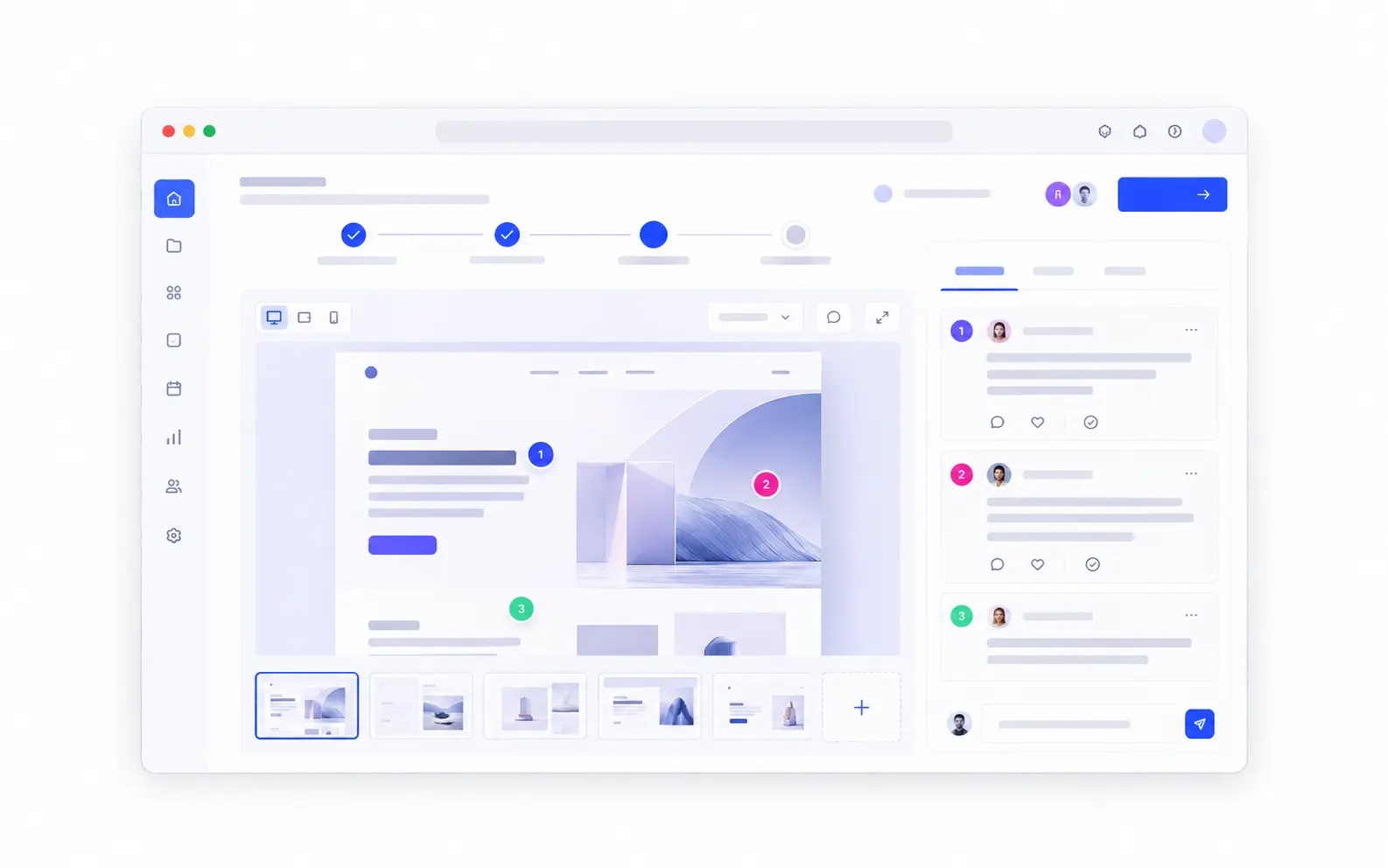
You can spend months getting a product to work and still struggle to explain it in one sentence.
The features are there. The main workflow works. You've tested the important parts and you're finally ready to show people what you've built.
Then comes a different challenge: the website.
A good SaaS landing page doesn't need to explain everything about your product. It needs to help the right visitor understand what it does, why it matters, and what to do next.
Here's what to focus on before your first launch.
Start With the Problem, Not the Technology
Imagine you've built a tool that helps small agencies collect client feedback and approvals.
You could introduce it as "An intelligent collaboration platform for modern teams." It sounds polished, but it doesn't tell a potential customer much.
Now compare that with:
"Get client approvals without chasing feedback across emails and spreadsheets."
The second version is more specific. It describes a recognizable problem and gives someone a reason to keep reading.
Your headline should make three things clear: who the product is for, what problem it solves, and what becomes easier when someone uses it.
You don't need a clever slogan. You need a useful explanation.
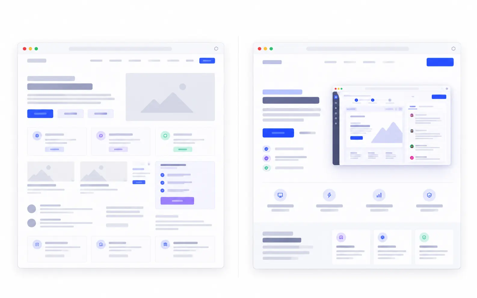
Show the Product Doing Something Useful
Visitors shouldn't have to imagine what your interface looks like.
A focused product screenshot can explain more than a paragraph of feature descriptions, especially when it shows a task your audience already understands.
If your product organizes client approvals, show the approval workflow. If it helps teams understand customer feedback, show how that feedback becomes something actionable.
Choose one meaningful screen rather than presenting the entire dashboard at once.
A short caption can help explain what matters in the image. Something as simple as "Review feedback, approve changes, and keep decisions in one place" gives the screenshot context.
The goal isn't to show how many features you've built. It's to show what someone can accomplish with them.
Give the Page a Clear Structure
A visitor is usually trying to answer a small set of questions.
What is this? Is it relevant to me? How does it work? Why should I trust it? What happens if I click?
Your page should answer those questions without making people hunt for information.
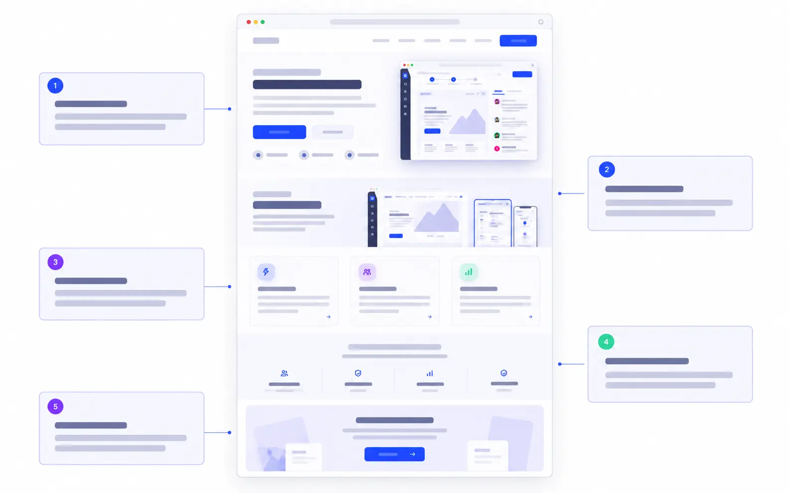
For an early-stage SaaS product, a useful starting structure is:
- Hero: Explain the core problem, outcome, and next step.
- Product preview: Show the main workflow in context.
- Key benefits: Connect important features to real tasks.
- Proof and reassurance: Give people reasons to trust what they see.
- Final action: Make it easy to try the product or get in touch.
This isn't a fixed formula. Some products need pricing information earlier. Others need a short demonstration before the benefits make sense.
The structure should follow what your visitor needs to understand, not simply what other SaaS websites are doing.
Build Trust With What You Actually Have
Early-stage products don't always have testimonials, customer logos, or detailed case studies. That's normal.
What matters is being honest about where the product stands.
If the product is working, show the actual interface. If you're accepting early users, explain what they can expect. If there's a limitation that affects the decision to try it, don't hide it behind vague promises.
Useful proof might be a short product walkthrough, a real integration, a clearly explained workflow, or a transparent description of what's available today.
You don't need to manufacture credibility.
A page that makes a few specific, supportable claims is more useful than one filled with impressive-sounding statements that nobody can verify.
Make the Next Step Feel Natural
Not every product should ask visitors to do the same thing.
If the product is ready for self-service, Try the product may be the obvious action.
If access is limited, Join the beta sets a more accurate expectation.
If setup requires a conversation, Book a demo or Talk to us may make more sense.
The important thing is alignment. The button should match what someone is actually going to experience after clicking it.
And once you've chosen that next step, make it easy to find. Visitors shouldn't have to navigate through unrelated pages just to understand how to begin.
Check for Clarity Before You Launch
Before publishing, ask someone who hasn't worked on your product to look at the page.
Give them a few moments to explore, then ask:
- What do you think this product does?
- Who do you think it's for?
- What would you expect to happen if you clicked the main button?
Listen to their answers without explaining the page for them.
If they misunderstand the offer, that doesn't automatically mean the design needs a complete rebuild. Often, a clearer headline, a better screenshot, or a more direct call to action can solve the problem.
Check the mobile experience too. A headline that reads well on a large screen can become difficult to scan on a phone. The product image and primary action should still make sense at a smaller size.
Your Launch Page Has One Job
A launch page won't fix a product that doesn't solve a meaningful problem. It can't replace user research, product quality, or a clear understanding of your audience.
But when you've built something useful, the website shouldn't make that value harder to see.
Start with the problem. Show the product. Explain the benefits in plain language. Give visitors a reason to trust you, then offer a next step that makes sense.
You can always add more detail later.
For your first launch, clarity is a better starting point than complexity.